How to use
Artifactory
Ready to use npm packages can be found in BDC Cloud Artifactory: https://artifactory.boschdevcloud.com/ui/repos/tree/General/lab000089-npm-release-local/@bosch/frontend.kit-npm/-/@bosch. The last version recommended by us is 4.1.1
For access to BDC Artifactory request role IDM2BCD_BDC_Artifactory_01_perm74_reader from oneIDM.
In case you have any trouble logging on, please write to Polina Soboleva BD/SWD-WDE4
Configuration
Configuring npm project
To be able to install our packages you need to configure artifactory authorization in your .npmrc file (.yarnrc.yml for yarn projects):
-
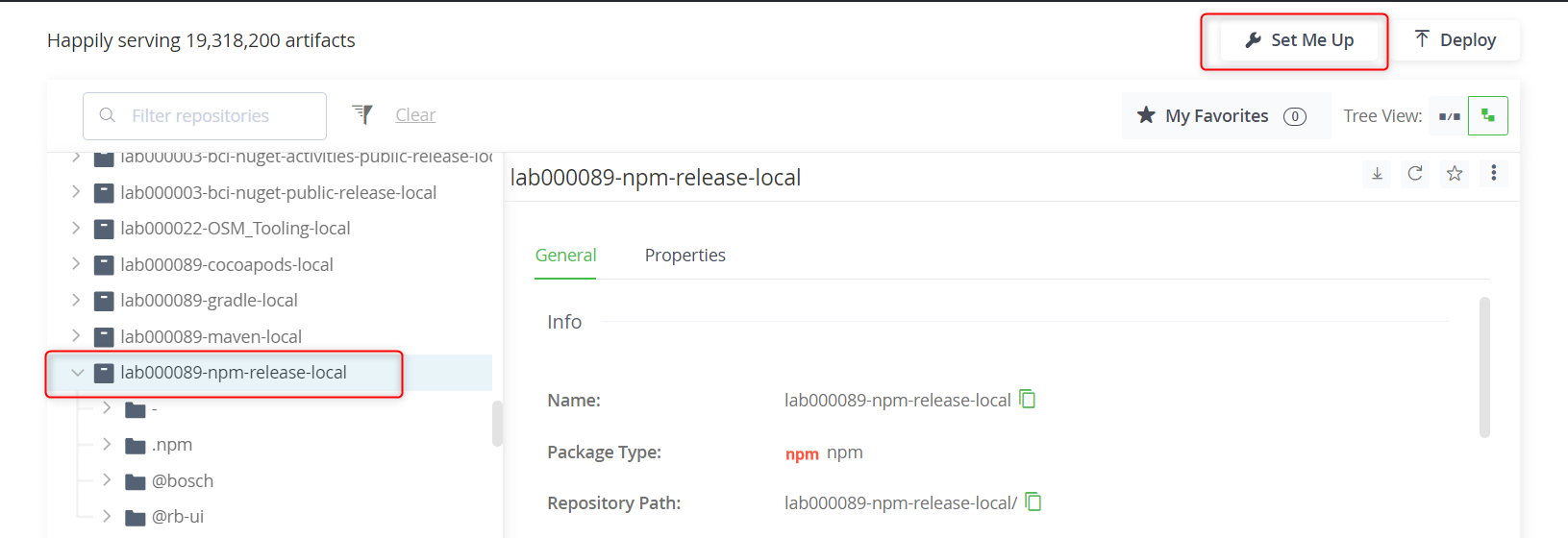
Access our repo in BDC Artifactory.
-
Click at "Set Me Up" button
-
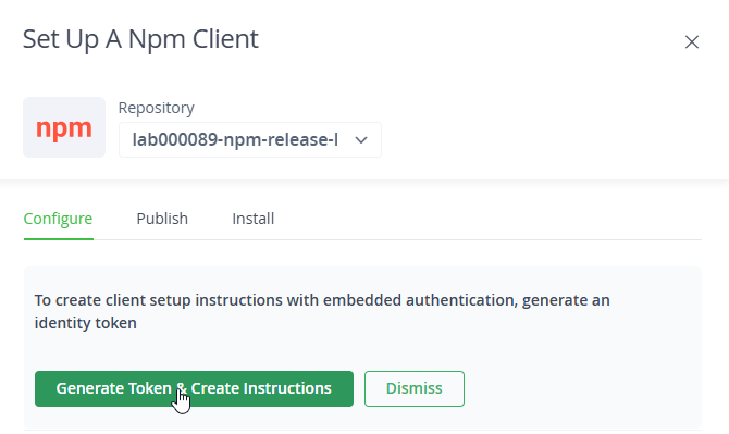
Click at "Generate Token & Create Instructions" button
-
Following the instructions for scoped authorization, create your .npmrc file
-
Аdd reference to @bosch/frontend.kit-npm@4.1.1 package in dependency section of your package.json file and run
npm install. This will download frontend-kit package to your node_modules directory.{ "name": "frontend-kit-consumer", "version": "2.0.0", "description": "", "main": "index.js", "author": "", "dependencies": { "@bosch/frontend.kit-npm": "^4.1.1" } }
Configuring JS frameworks
- Read here how to integrate FROK with major JS frameworks
Configuring project without npm
-
Download frontend-kit package from our repo in BDC Artifactory.
-
Copy files from dist folder to your project
-
Reference frontend-kit.js and frontend-kit.complete.css files somewhere in your project. In most case it will be root file of your project like index.html (you may use smaller chunks of css, described further on this page)
-
Copy a markup of the selected component from the preview server. To sign in to the preview server, please use the following credentials: login/password: bosch/uneo2019 (in our example we coppied "button" component)
<!DOCTYPE html>
<html>
<head>
  <title>Exmaple usage of the FROK</title>
  <link href="my-custom-folder/frontend-kit.css" rel="stylesheet" />
</head>
<body>
  <button type="button" class="a-button a-button--primary -without-icon">
    <div class="a-button__label">Button label</div>
  </button>
  <script src="my-custom-folder/frontend-kit.js"></script>
</body>
</html>
The script will search for all FROK components and will attach the relevant logic to it. If the initialization needs to be done again, e.g. after the content of the page has changed, the following function from the window can be called:
window.initBoschFrontendKit()
Files
The distribution package of the FROK contains the following files:
- frontend-kit.complete.css: css file containing all styles of the FROK components. Light mode and dark mode included, both which can be set via css selectors:
-light-mode&-dark-mode - frontend-kit.js: contains javascript code of the FROK components
- font files (boschsans*, bosch_icon*) - bosch font files
Styles in smaller chunks
Starting from version 4.0.0 FROK provides the CSS also in a more fine-grain distribution. Instead of importing the frontend-kit.complete.css, it is now possible to import the following parts:
| file name | mandatory | selector | description |
|---|---|---|---|
| frontend-kit.foundations.css | yes | - | includes the basic font and icon definitions, colors, ui-icons, typography, layout and focus-state |
| light-mode-gradations.css | no | css selector -light-mode or none |
includes light mode definitions of the color-set |
| dark-mode-gradations.css | no | css selector -dark-mode |
includes the dark mode definitions of the color-set |
| dark-mode-media-gradations.css | no | @media (prefers-color-scheme: dark) | includes the dark mode definitions of the color-set |
| light-mode-all-backgrounds.css | no | css selector -light-mode or none |
includes all theme definitions for the light mode |
| light-mode-primary-all-schemes.css | no | css selector -light-mode or none |
includes all theme definitions for the primary background in light mode |
| light-mode-primary-schemes.css | no | css selector -light-mode or none |
includes only non-nested theme definitions for the primary background in light mode |
| light-mode-secondary-all-schemes.css | no | css selector -light-mode or none |
includes all theme definitions for the secondary background in light mode |
| light-mode-secondary-schemes.css | no | css selector -light-mode or none |
includes only non-nested theme definitions for the secondary background in light mode |
| light-mode-contrast-all-schemes.css | no | css selector -light-mode or none |
includes all theme definitions for the contrast background in light mode |
| light-mode-contrast-schemes.css | no | css selector -light-mode or none |
includes only non-nested theme definitions for the contrast background in light mode |
| dark-mode-all-backgrounds.css | no | css selector -dark-mode |
includes all theme definitions for the dark mode (provided via -dark-mode) |
| dark-mode-primary-all-schemes.css | no | css selector -dark-mode |
includes all theme definitions for the primary background in dark mode (provided via -dark-mode) |
| dark-mode-primary-schemes.css | no | css selector -dark-mode |
includes only non-nested theme definitions for the primary background in dark mode (provided via -dark-mode) |
| dark-mode-secondary-all-schemes.css | no | css selector -dark-mode |
includes all theme definitions for the secondary background in dark mode (provided via -dark-mode) |
| dark-mode-secondary-schemes.css | no | css selector -dark-mode |
includes only non-nested theme definitions for the secondary background in dark mode (provided via -dark-mode) |
| dark-mode-contrast-all-schemes.css | no | css selector -dark-mode |
includes all theme definitions for the contrast background in dark mode (provided via -dark-mode) |
| dark-mode-contrast-schemes.css | no | css selector -dark-mode |
includes only non-nested theme definitions for the contrast background in dark mode (provided via -dark-mode) |
| dark-mode-media-all-backgrounds.css | no | @media (prefers-color-scheme: dark) | includes all theme definitions for the dark mode |
| dark-mode-media-primary-all-schemes.css | no | @media (prefers-color-scheme: dark) | includes all theme definitions for the primary background in dark mode |
| dark-mode-media-primary-schemes.css | no | @media (prefers-color-scheme: dark) | includes only non-nested theme definitions for the primary background in dark mode |
| dark-mode-media-secondary-all-schemes.css | no | @media (prefers-color-scheme: dark) | includes all theme definitions for the secondary background in dark mode |
| dark-mode-media-secondary-schemes.css | no | @media (prefers-color-scheme: dark) | includes only non-nested theme definitions for the secondary background in dark mode |
| dark-mode-media-contrast-all-schemes.css | no | @media (prefers-color-scheme: dark) | includes all theme definitions for the contrast background in dark mode |
| dark-mode-media-contrast-schemes.css | no | @media (prefers-color-scheme: dark) | includes only non-nested theme definitions for the contrast background in dark mode |
| frontend-kit.fonts.css | no | - | includes all font definitions |
| frontend-kit.icons.css | no | - | includes all non ui-icons. If only ui-icons are used this file can be omitted |
| frontend-kit.atoms.css | no | - | includes all style definitions for the atoms |
| frontend-kit.molecules.css | no | - | includes all style definitions for the molecules |
| frontend-kit.organisms.css | no | - | includes all style definitions for the organisms |
Be aware when using molecules from the FROK, it is recommended also to include the styles for the atoms, because molecules are usually built on top of atoms. The same is true for organisms, then molecules should also be included.
Example combination of the styles:
This collection would recreate the frontend-kit.complete.css, with the change that the dark mode would be applied via @media (prefers-color-scheme: dark)
frontend-kit.foundations.cssfrontend-kit.fonts.csslight-mode-gradation.cssdark-mode-media-gradation.css- change to the providedfrontend-kit.complete.csslight-mode-all-backgrounds.cssdark-mode-media-all-backgrounds.css- change to the providedfrontend-kit.complete.cssfrontend-kit.icons.cssfrontend-kit.atoms.cssfrontend-kit.molecules.cssfrontend-kit.organisms.css
This collection would create a CSS capable of displaying all atoms only with ui-icons in dark-mode (via -dark-mode css selector) only on primary and secondary background, without nested or contrast backgrounds.
frontend-kit.foundations.cssfrontend-kit.fonts.cssdark-mode-gradations.cssdark-mode-primary-schemes.cssdark-mode-secondary-schemes.cssfrontend-kit.atoms.css
In future releases, we will also provide imports for single components.
License
Copyrights 2020-2022 Robert Bosch GmbH All rights reserved.